

9 Signs Your SaaS Marketing Strategy Is in Trouble
Does your product marketing feel stuck? Maybe everything seems in place, but the results aren’t what you were ...

Every company approaches their website differently. For some, it’s enough to simply have an updated website design that looks great. Others might feel somewhat lost when it comes to how a website should be designed and organized.
As the central point for all of your inbound efforts, your website should ultimately attract, convert, close and delight potential customers.
Specifically, there are six best practices to keep in mind when optimizing your website with inbound marketing.
You can optimize your website for search engines by using relevant keywords and focusing on the topics that people in your industry are searching for. What does optimization include?
Write On-Point Page Titles & Descriptions. Use keywords in page titles and meta descriptions to detail the specific content on each page. Be as accurate as possible so that search engines know when to display your page in results, and so potential visitors can decide whether or not your site is relevant to them.
Compose Useful URLs. It’s important to include keywords in your URLs, and the way you structure them can make a big difference. Use hyphens to separate each word rather than underscores or keeping all of the words together. For example, the URL, /employee-scheduling-software, is much more useful to search engines than, /employeeschedulingsoftware.
Display Precise Navigation Links. Search engine optimization should also be taken into consideration for your website design. Your main navigation links should be as specific as possible. For example, if you sell a software suite for hospitals, the link “Products” is too generic, whereas “Hospital Software” would be more precise.
Include On-Page SEO. Another way to help search engines easily crawl your site, is by using on-page tags. Search engines can’t “see” images in their natural state, so using keywords as alt tags is an additional way to show them what the page is about. H1 tags are also useful for helping search engines understand the structure of your pages.
Capitalize on Blog Topics. When it comes to your blog, you are likely already using keywords for headers and in copy throughout your articles, but keywords can also stand out in search when used as blog topics. So, take the time to carefully pick around 15-25 unique, keyword-centric topics to make up your list.
Build Pillar Pages. A pillar page focuses on your expertise in a particular industry topic. They are authoritative, in-depth pages with more content than a regular blog post. Since Google’s goal is to provide people with results that have the best, most accurate information, pillar pages are more likely to rank higher in search results. Once you’ve chosen a pillar page core topic, write or select existing blog posts (around 10-20) and add links connecting them to the pillar page and vice versa.

Potential customers want to work with a company they can trust as an expert in your industry. How can you create this trust?
Channel Your Inner Author. Show them you are an expert in your field and that you’re keeping an eye on the future by regularly posting blogs. Subject matter should include general knowledge and information, frequently asked questions as well as current events and trends.
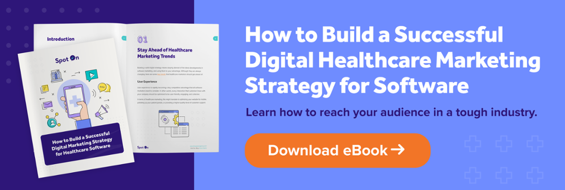
Offer Expert Advice. Stand out from competitors by building a resource library filled with ebooks, tip sheets, webinars, and white papers that address your target audience’s challenges as well as possible solutions. Provide options to sort through the resources with filters for content type and topic. With that kind of in-depth information, they’ll learn that they can turn to you for help and advice when they need it.
Show Customer Proof. Let them hear straight from the source. Client testimonials act as on-the-spot recommendations and provide an inside look of what it’s like to work with your company.
Highlight Case Studies. Last but not least, nothing says “We know what we’re doing” more than cold hard facts. A case study with real statistical data, detailing ways you have improved the business/lives of your clients, is the absolute best way to establish authority.
A great user experience on your website will help effectively communicate your message to visitors, and also support the needs of your potential and existing customers.
Solidify Sitemap Structure. Creating a successful user experience can begin even before a website is ever built. When creating your sitemap, ask these questions: What is the most logical organization of the pages from the perspective of a website visitor? Which information can be combined and what should stand on its own?
For example, most websites don’t need separate pages for their mission statement, company history and team members. Putting it all under the umbrella of the about page, will give your visitors the full picture of your company in one take. Are there any pages that appear in your sitemap more than once? If so, consider removing all but one to avoid confusion.
Stay Focused. Each page should have one main focus, with one main call to action button. If your message is all over the place and you have a ton of CTA buttons, your visitor will have a difficult time deciphering the point of the page and where to go next.
Be Clear & Concise. Your website should be able to pass the five second test. Meaning, within the first five seconds of visiting your website, the message should be clear and concise. Visitors should immediately understand what you provide and how it’s beneficial to them. Keep paragraphs short and use bullet points for easy digestion.
Be Consistent. Consistency is the enemy of confusion. Headline size, font selection, color choices and design elements should match from page to page for users to easily identify your brand. Any time you mention a product or service, use the same wording so you don’t complicate what’s being offered. For example, if you provide “History Courses,” don’t refer to it on a different page as “Social Studies Classes.” Visitors may not follow that these two are one in the same.
Keep Clean. Don’t distract visitors with top of the page sliders or cram your pages full of text and graphics. Use ample “white space” (also known as empty areas) so they are able to focus on your main message.
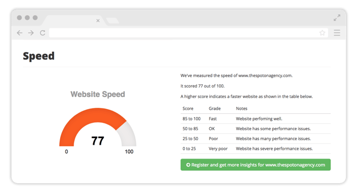
Speed Up Page Load. HubSpot considers 1.5 seconds as the ideal load time for your pages. If page load takes any longer than 3 seconds, you could lose a potential customer forever. To improve site speed, make sure all images are under 100kb where possible, resolve any broken links, and keep embedded features to a minimum.
Offer Secondary Navigation & Search. Keep visitors on your site longer by helping them find what they need more quickly. On pages with a lot of content, add a secondary navigation that anchors directly to each section, and a “back to top” button to eliminate the need for excess scrolling. If your site has a lot of pages and blog posts, add a search bar to your header for instant results.
Optimize for Mobile. According to Google, more than 50% of search queries come from mobile devices. Beyond good design and high-quality functionality, consider removing images or cutting text on mobile to simplify for smaller screens. Make sure the font and call to action buttons are large and legible.
Install Tracking Software. After you launch your website, you can really get a better picture of how visitors are interacting with it. Installing tracking software can provide great insight through click-and-scroll heatmaps, screen recordings, and visitor surveys. Below see an example of what a heatmap might look like.
![]()
The last tip for user experience: While your website should have a unique design, don’t try to reinvent the wheel. Repositioning vital information can make your website hard to navigate. Visitors are used to seeing menus along the top of the page, they are comfortable with sidebars on a blog. This is one aspect where it’s a good idea to go the traditional route.
When a visitor arrives to your site, you should be able to speak to them directly, based on their industry or position.
Use Relatable Photography. Select photos that your audience can relate to. If you target teachers, use photos of teachers, students and classrooms, if you target doctors, use photos of doctors, medical tools and supplies.
Personalize by Industry. If you work with multiple industries, dedicate a page to each one. Speak to their individual pain points and explain how you can help resolve their problems.
Apply Smart Content. Once a visitor becomes a contact, you can set up personalization tokens in HubSpot to display information that is most useful to them. Smart content can be useful to you as well, by helping move contacts along in the sales funnel. For example, if someone previously downloaded one of your ebooks and visits a page that normally promotes that ebook, you can use a smart CTA to show the next logical piece of content instead.
You’ve spoken to them; now let them learn more about you. The Internet can be a cold and sterile place, showing faces and information about team members can add warmth to your site and help build trust.
Introduce Team Members. Displaying photos of your team members on the about page is a great start but adding a bio for each person goes one step further in helping visitors learn more about who they may be working with. If page space is limited, consider a bio that appears when someone hovers over or clicks a photo.
Bio Blog Authors. Give a personal touch to blog articles by providing a short paragraph about the author. This can go either in the sidebar or at the bottom of a post. Include their photo, a link to display all of their blog posts, and icons to connect with them on social media.
Your website should be a two-way street. Your pages and posts speak to your visitors, but other than your contact form, are there ways for them to reach you?
Show Your Social. Make it easy for visitors to get in touch through social media by placing linked icons in your sidebar or footer. With access to your accounts, they can post on your Facebook page, direct message you on Twitter or connect with you on LinkedIn.
Turn On Comments. The comment section at the bottom of your blog articles is an excellent place to strike up a conversation with your readers. It allows visitors to ask questions and give feedback about the topic at hand. Be sure to reply to all comments in a timely manner to promote continued engagement.
Enable Live Chat. Folks today are all about that instant gratification. If they’re browsing your site and need more information about a product or service, a live chat message box can keep them from moving on to one of your competitors.
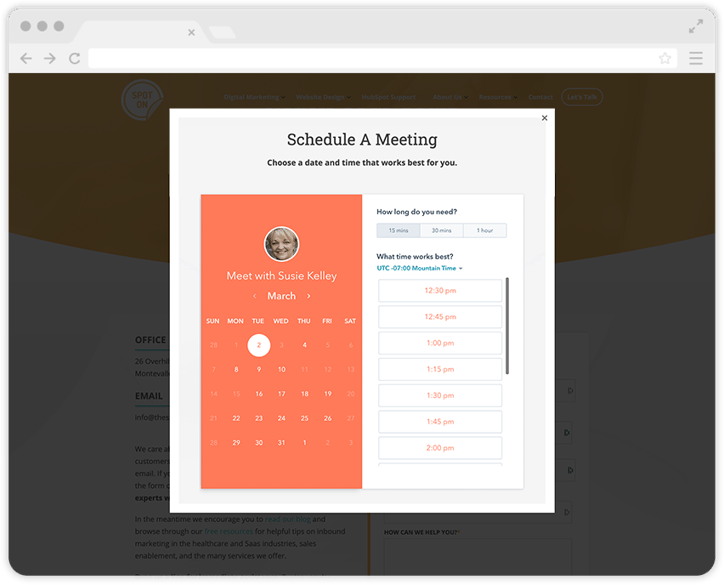
Share Your Calendar. Do away with scheduling headaches that result from back and forth emails or phone calls. Let your visitors schedule a meeting automatically with the click of a few buttons. Embed a calendar app that shows the dates and times you’re available so they can select which option works best for them.
The last area we review, is your websites ability to convert visitors. Attracting a lot of website traffic is a beautiful thing, but if you aren’t converting your visitors into leads, then your website isn’t doing its job. So how do you capture that sacred email address as well as other key contact information?
Create Catchy CTAs. Place lead generation call to action buttons above the fold (also known as before the scroll) so that they can’t be missed. Make your call to action buttons stand out, but not spammy. They should fit into the design of your site seamlessly. Be sure your CTAs are action-oriented and explain the content a visitor will receive when clicked. So rather than “Learn More” or “Click Here” – try “Watch the Webinar” or “Download the Ebook.”
Simplify Landing Pages. Your landing pages have one crucial job, and that’s to convince visitors to fill out your form. Keep visitors focused by removing all navigation links in the header and footer. Write descriptive copy to highlight that this is an offer they can’t afford to lose. Display the least amount of form fields necessary to gate the content. HubSpot’s smart fields can help gather more information by swapping out old questions with new ones when a returning contact fills out a similar form.
Utilize Thank You Pages. Thank you pages can be used for more than a brief thank you note and a link to a download. You can use them as chance to further engage your contacts. If they just downloaded a white paper, you might display a form on your thank you page for a free consultation. Another option, is to display blog posts related to the offer they just received.
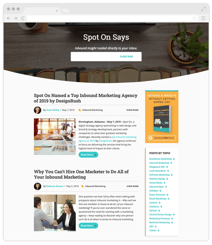
Add Subscribe Options. Add a subscribe form to your blog and main site footer. If visitors like what they read on your blog, they may want to stay tuned for more. It’s a win-win. You get their email address, and they get helpful articles delivered to their inbox.
Reduce Friction. If you have a specific task you want a visitor to complete on your website, make it simple for them to complete it. Reduce the number of steps they need to finish the process by cutting out any pages in between that are not absolutely necessary.
The days of static, brochure-like websites are over. Your site can provide so much more for you and your potential clients, than an old-school digitalized PDF. It should run at peak performance and have a unique, modern look, that represents where your brand is today.