Done well, a software marketing campaign leads hundreds of visitors directly to landing pages. What happens there, however, makes or breaks the ROI. Even the best inbound marketing strategies can fall completely flat if landing pages aren't carefully crafted to drive action.
Sometimes this action requires downloading an eBook or Whitepaper; other times it's a hard sale. In either case, the goal is to make it impossible for visitors to resist filling out the form, inviting you to more directly engage with them and moving further into the net you've cast.
There are all kinds of mistakes that can be made along the way, however – mistakes that will negatively impact sales. Here are 7 of the biggest landing page mistakes to avoid.
Slow Loading Times
Conversion windows are pretty short, especially for first-time customers. They're nervous about committing, so your marketing must leave no time for hesitation. While quick loading times are important for all website pages, they're particularly important for landing pages where you need to capitalize on the momentum you've gained. Use Google's PageSpeed Tools to ensure landing pages load quickly across the spectrum of devices.
Cluttered Format
Landing pages should be inviting, and clutter is a major repellent. A clean, minimalist landing page format is typically the easiest and most effective approach, creating a clear path for visitors' swift action. Too many colors, fonts, text sizes, images, or buttons will muck things up and increase bounce rates.
Confusing Instructions
If you've learned anything about the average website visitor, you know most people scan first, read later – if they thoroughly read at all. For a landing page, where quick conversion is of the essence, scannability is key. Too much verbiage can be confusing. In a quick scan, a landing page visitor should know:
- Who you are
- What product, service, or content piece they'll receive
- The benefits of the product, service, or content piece
- How to receive it
For bottom-of-the-funnel offers, you'll also want to include a short, clear customer testimony or two, clearly written at the bottom – "proof" about how awesome their lives will be now that they've found you.
Mystery CTA
Similarly, the CTA needs to be very clearly defined. If they're hunting around trying to find where to click, you've lost opportunities. It should be so obvious that visitors have a difficult time not automatically clicking on the button or image.
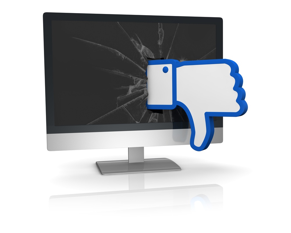
Broken Link(s)
Ach! Have you ever gone to take action on a landing page, only to click on a broken CTA that doesn't go anywhere? Or one that goes to somewhere more complicated? Or one that simply doesn't work? Don't send visitors into "no sale land." Make sure that every CTA works, every form submission submits correctly, and every download leads to the promised result.
Demanding Too Much Info
How much information do you really need when it comes right down to it? In this day and age, especially for top-of-the-funnel conversions, a name and email address should be enough. When people have to submit copious amounts of information, they balk. After the fourth or fifth block of information, visitors are likely to bounce off the page – a travesty when you could have had them at Line 3.
It's a Dead-End Road
Give some kind of "I changed my mind" or "Maybe later" option that leads to another, lighter relevant landing page or offer. This keeps your inbound marketing strategy connected. If someone was interested enough to get to a landing page, inspire them to take action elsewhere.
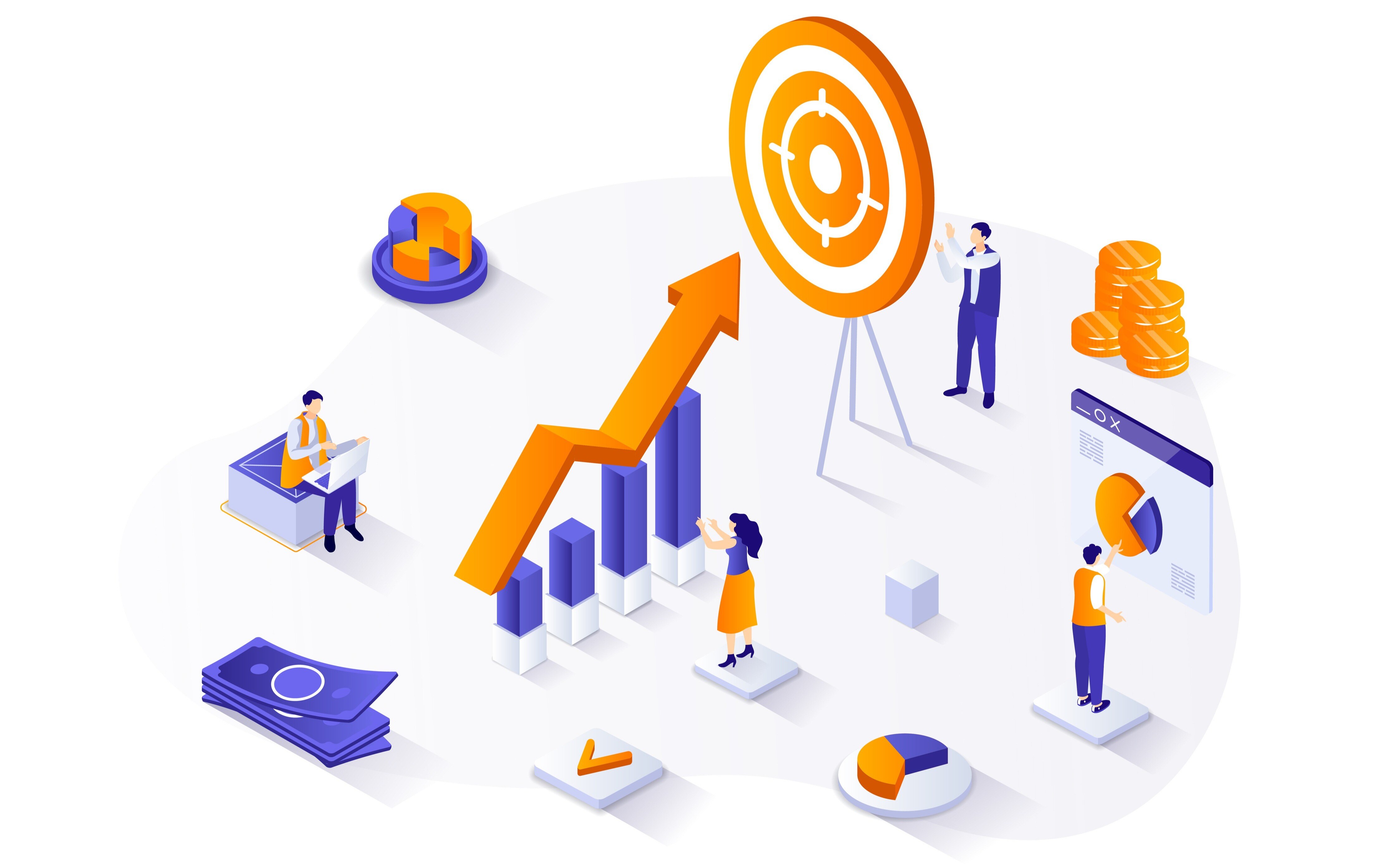
Are your landing pages guilty of any of these mistakes? Correct them and the ROI of existing inbound marketing campaigns should notably improve.